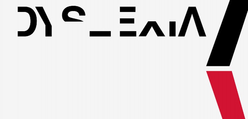

It's common sense that when it comes to fonts in the worlds of design and advertising, the more easily readable the better right? Graphic designer Daniel Britton has bucked convention (and some might argue his marbles) with a new font that he's designed to be as challenging to read as possible. Though for a very good reason. Britton's font aims to emulate and demonstrate how frustrating it can be to suffer from dyslexia, by making it a challenge for non-sufferers to read words when formed into complete sentences.
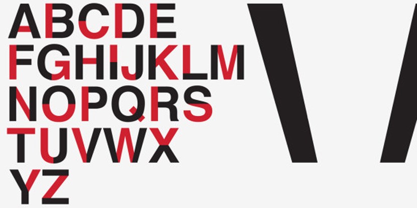
Britton developed the font because he believes the learning difficulty (which affects over 700 million people worldwide and around 1 in 10 people in the UK) to be misunderstood and under-researched. He designed the font and the accompanying images in his final year at university to raise awareness of the condition, from which he himself discovered that he suffered only recently. To slow down a non-dyslexic person’s reading speed, Britton removed 40% of the lines on each letter, making sentences more challenging to read. He notes that whilst his font doesn't show what a dyslexic individual sees when they're scanning text, it recreates the frustrating experience most face when reading.
Daniel Britton's font aims to emulate and demonstrate how frustrating it can be to suffer from dyslexia
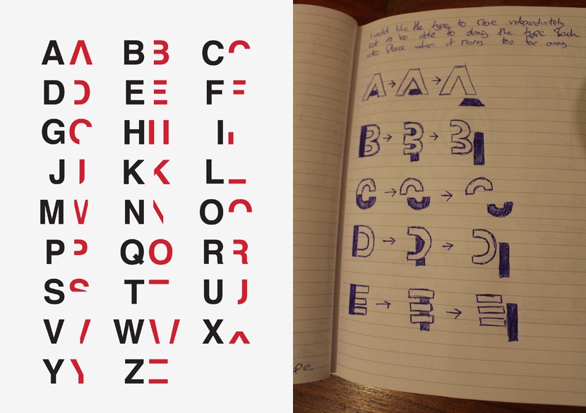
Britton was inspired to create the font and the accompanying campaign because he felt that previous campaigns focused on dyslexia didn't do the condition justice. He said: “The rhetoric about people with dyslexia is that they’re stupid, they’re lazy, they’re not trying. When people try to simulate dyslexia, they’ll make some letters blurry, put an 'e' back to front and open up the spaces between words.” His campaign, on the contrary, is a more considered and less condescending attempt at legitimately helping people understand what dyslexic people have to struggle with every day of their lives.
Explaining the condition as he sees it, and how his font hopes to replicate the effects, Britton said: “People’s brains can overcome that and decode it. So people can still read it. So it’s not like having dyslexia at all. For most people with dyslexia, the letters and numbers do not jump around on the page and the colours remain the same. It is simply a breakdown in communication between the eye and the brain. You can see the information, you can see each letter perfectly but there is something in your mind that is stopping or slowing the process of information.”
Britton was inspired to create the font because he felt that previous campaigns focused on dyslexia didn't do the condition justice
The font can't be downloaded for use yet, but Britton has started a Crowdfunder campaign to create a “Dyslexia awareness pack” that can be used by schools. He would like to raise £2,000 so that he can create the pack for children both in Primary and Secondary school across the globe. The Idea is that he'll make the packs to order initially, and once the project is self-sufficient, he'll then begin the process of advertising it to a wider market, beginning in London and North America, where the project has gained the most vocal support thus far.
A Sample Paragraph
The writing in the image above reads: “This typography is not designed to recreate what it would be like to read to read if you were dyslexic, it is designed to simulate the feeling of reading with dyslexia by slowing the reading time of the viewer down to a speed of which someone who has dyslexia would read.”